After a few warming assignments; Untitled (Up and Down/Out), Barcode explorer (the result is unfortunately not posted, as I have used a beautiful song by Bel Canto, and do not have permission to post) and the three portraits in the Personal assignment, I have started on the last one, actually the last one for this semester.
The assignment is to be at least five pictures, and I am planning a series of six. Working title is "What you see or how you feel?" and I want to take pictures of somebody and his/her shadow posing three different distinct feelings and their opposite, -in all six pictures. Hope my camera and I can handle it. I will match the shadow and the opposite pose in photoshop.
I know who I would like to ask to model. I hope she has the time, and cross my fingers for managing the photoshop job..
Wish me good luck people!
Wednesday, December 7, 2011


Sunday, November 27, 2011
Personal - digital photo
First of three assignment for our digital photo period delivered! The assignment - personal - is three portraits, and I find it very difficult to take pictures of people. I have learned a lot about myself during this, in addition to developing my photographic skills.
The first picture was to portrait a person. The aim was to get the viewer to get the feeling of knowing the person a bit after seeing it. You can make up your own minds about whether I succeeded or not, but it works for me anyhow.
 The second is meant to show activity, and the persons role in the environment. Do not think it fits 100% to the core of the assignment, but I like the picture.
The first picture was to portrait a person. The aim was to get the viewer to get the feeling of knowing the person a bit after seeing it. You can make up your own minds about whether I succeeded or not, but it works for me anyhow.

 |
| eirik |
On the last picture we were supposed to "be in the picture" - as photographer. Well, I like it.
 |
Wednesday, November 16, 2011
Still life painting - Exhibition KD2K HiOA 2011
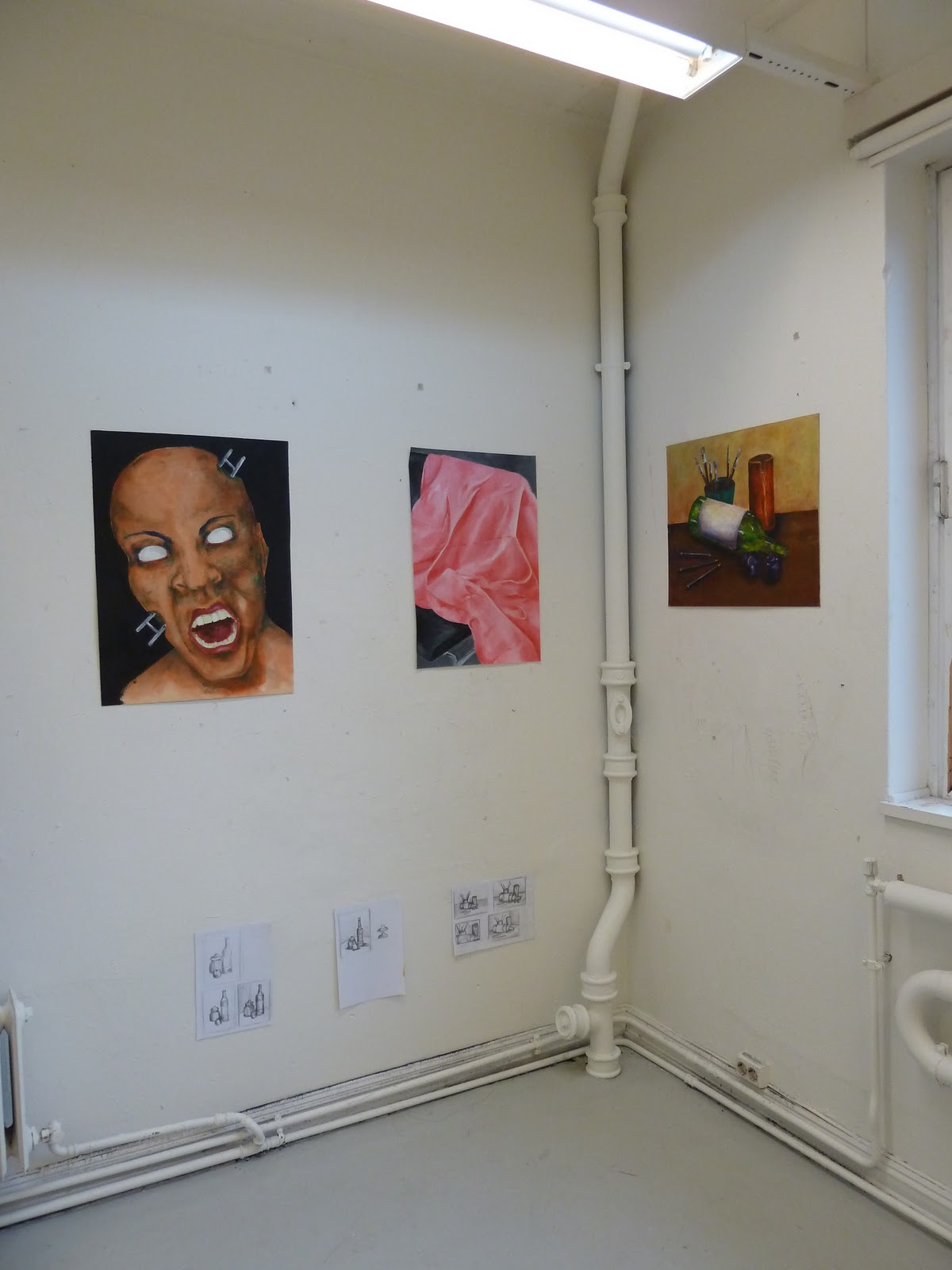
Finally managed to shoot some pictures from our exhibition from the painting period. The main focus of the period has been still life painting, with emphasis on color and levels in the picture. We have also had some 20 minutes still life paintings, also exhibited.
Andrine Lauritzen
She has done a little of each during the period. The head with the ladder is taken from her exam from this summer, originally drawn, and even I have to like pink when I see the beautiful fabric on the chair (love the chair as well actually..)!
I actually think he hates painting still life. Did his own thing as soon as possible, and I think the result is great! Some kind of link between science and art, with naval as well as mathematic elements. Again he manages to make me like this kind of abstract artwork, and it is normally not the visual language form of my choice.
Andrine Lauritzen
She has done a little of each during the period. The head with the ladder is taken from her exam from this summer, originally drawn, and even I have to like pink when I see the beautiful fabric on the chair (love the chair as well actually..)!
 |
| Andrine Lauritzen |
 |
| Andrine Lauritzen |
Feliks Ulvåen Isaksen
I actually think he hates painting still life. Did his own thing as soon as possible, and I think the result is great! Some kind of link between science and art, with naval as well as mathematic elements. Again he manages to make me like this kind of abstract artwork, and it is normally not the visual language form of my choice.
 |
| Feliks Ulvåen Isaksen |
Grete Heathcliff Halvorsen
She has been one of the absolutely most patient painters this period. She picked a small piece of a still life, and have used almost the full period on these berries. Even though she does not feel completely finnished with this picture I really think it works as a finished piece. The variations of fineness in the berries reminds me of the imperfectness of nature. Really nice done Grete!
 |
| Grete Heathcliff Halvorsen |
Hilde Marie Blindheim
Her love for flea markets and bright colors are loves I shear, and I think is, at least the last one, visual in this exhibition. Daring to use such colors in her pictures is certainly a good thing in my book.
 |
| Hilde Marie Blindheim |
 |
| Hilde Marie Blindheim |
Kjersti Solbakken
Kjersti also uses the bright color palette. I especially like her brush strokes and the light she catches in her picture.
 |
| Kjersti Solbakken |
 |
| Kjersti Solbakken |
Kristine Heidenstrøm
I always liked Kristines style. She has something honest about her work. I have watched her learning a lot this period, and will have to say "Good work girl!". I forgot to take a close picture of one of my favorites - the "20 minute still" down in the middle of her exhibition. I would have loved to have it on my wall.
 |
| Kristine Heidenstrøm |
 |
| Kristine Heidenstrøm |
 |
| Kristine Heidenstrøm |
Line Stenrud Utengen
Line was one of three painting a still with shoes and a teapot, the other ones being Mali and myself. She finished a long time before the other two of us, and did a great study of some fabric and yarn the rest of the period. The way she manages to get the difference in texture and the difficult colors on the piece in the last picture is really inspiring.
 |
| Line Stenrud Utengen |
 |
| Line Stenrud Utengen |
 |
| Line Stenrud Utengen |
Mali Norvalls
Mali and me have followed each other through the whole period, doing our one study of the shoes with teapot scene. It is really fun comparing the different styles, learning from each others paintings, and end up with such different results as ours. The background in Mali's painting is really nice, I like it a lot better than mine, but it is just not "me". The picture below is unfortunately a bit dark, and does not show the painting the respect it deserves.
 |
| Mali Norvalls |
 |
| Mali Norvalls |
Pernille Gullerud Knudsen
Pernilles style is realism. She is always searching the perfect, and it shows in her work. She is not finished with the last painting (two glasses), but I think it really works as it is.
 |
| Pernille Gullerud Knudsen |
 |
| Pernille Gullerud Knudsen |
 |
| Pernille Gullerud Knudsen |
Sarah Halse
As Feliks, not that into still life. I think her results from this period really shows her style, and I have to say I support her in using her time on that.
 |
| Sarah Halse |
Therese Nielsen
Therese keeps her japanese style, and I like it!
 |
| Therese Nielsen |
And my exhibition and finished picture looked like this:
 |
| Dagrun Østtveit |
 |
| Dagrun Østtveit |
Maybe I will write something more about my own experiences some other day.
Untiteled (Up and Down/Out)
The piece is put together of three pictures, each and together telling stories of a building, the people around it or of life itself.
A tall building (for Oslo standards at least..), from the ground to the 11th floor roof hatch.
Up and down, as life itself.
Get up and get out there.
Remember the ground you are standing on.
Looking up.
"Tall enough."
Climbing the ladder.
The ground.
(or "Somebody went up the ladder, looked down and splashed to the ground" as my darling niece colorfully put it.)
 |
| Untiteled (Up and Down/Out) (c) ludobabe og Mali Norvalls |
Tuesday, November 15, 2011
City Project - digital photo
Today we have started a new period with digital photo. We are starting off with a small City Project, where the assignment is to deliver a photo or a serial photos telling a story.
I teamed up with Mali, and had a short photo shoot today, just for inspiration and idea purposes. Three chosen pictures is to be presented tomorrow. Our shoot focused around the building we where in, Pilestredet Park 33, and we started shooting at the top floor (11th). When up there, we found ourselves wondering if it was possible to get out on the roof. It would be great to take pictures down, on the building and the ground below us. The "Look down!" version of the "Look up!" piece presented below. We concluded the roof hatch probably had a lock or an alarm, -no good having unauthorized people on top of an 11 stories high building.
The result will be posted tomorrow after the presentation.
As my "Tribute to the City" follows me, I have just put together some pictures from another great autumn day in my beautiful city. Who says Oslo is gray and boring?
Maybe we will use some of this for our City Project. We have only till Friday, so it would be nice having something to work with. -Time will show!
I teamed up with Mali, and had a short photo shoot today, just for inspiration and idea purposes. Three chosen pictures is to be presented tomorrow. Our shoot focused around the building we where in, Pilestredet Park 33, and we started shooting at the top floor (11th). When up there, we found ourselves wondering if it was possible to get out on the roof. It would be great to take pictures down, on the building and the ground below us. The "Look down!" version of the "Look up!" piece presented below. We concluded the roof hatch probably had a lock or an alarm, -no good having unauthorized people on top of an 11 stories high building.
The result will be posted tomorrow after the presentation.
As my "Tribute to the City" follows me, I have just put together some pictures from another great autumn day in my beautiful city. Who says Oslo is gray and boring?
 |
| "Look Up!" (c) ludobabe |
Monday, October 10, 2011
Still life painting
Painting is difficult.. I have not done much of it earlier, so my learning curve is pretty steep. I am working on this still life I have called "Coffee or tea?", and to be honest, I am pretty proud of myself! It is far from finished yet, but I believe you at least could spot the likeness...


By the way, Ludobabe has got her own page on Facebook! -"Like" to get updates on new posts on the blog and other fun stuff.
Sunday, October 2, 2011
The Sound of Color or the Color of Sound
Seeing, hearing, touching, smelling and tasting all affect our perception of the world around us. That one can affect the perception of the other is also pretty clear. The nature of the project limits the number of means to the first two. Originally I thought about spelling the color name while the yarn curls its way to show the letters on the paper. I like it easy, simple and clean, but it felt wrong. I wanted to use sound to emphasize the color, its wave and energy.
The colors we perceive are the result of waves of light absorbed or reflected to our eyes, interpreted by our physical eyes and our conscious and subconscious minds. This we know. Waves meeting our ears and interpreted by our physical ear and our conscious and subconscious minds is our perceived sound. Could I get the sound to emphasize the sensation of the color and the color to emphasize the sound?
The color of music, or the music of colors, have been explored by many composers, philosophers and artists through time. Some of them have worked with the scale, giving each note a color. I found this overview of some of them on the net.
I want to use the corresponding note to sing the color name in my animation. I have done some reading on some of the different theories on this, and have decided to go for Alexander Scriabin's color keyboard. The keyboard colors takes basis in the circle of fifths from music theory and Sir Isaac Newton's Opticks.
The colors we perceive are the result of waves of light absorbed or reflected to our eyes, interpreted by our physical eyes and our conscious and subconscious minds. This we know. Waves meeting our ears and interpreted by our physical ear and our conscious and subconscious minds is our perceived sound. Could I get the sound to emphasize the sensation of the color and the color to emphasize the sound?
The color of music, or the music of colors, have been explored by many composers, philosophers and artists through time. Some of them have worked with the scale, giving each note a color. I found this overview of some of them on the net.
 |
| picture from RhythmicLight.com |
I want to use the corresponding note to sing the color name in my animation. I have done some reading on some of the different theories on this, and have decided to go for Alexander Scriabin's color keyboard. The keyboard colors takes basis in the circle of fifths from music theory and Sir Isaac Newton's Opticks.
 |
| Scriabin's color keyboard picture from Wikipedia |
Subscribe to:
Posts (Atom)