Saturday, October 20, 2012

Anja Carr, Petter Buhagen and Monica Winther at Akershus Kunstsenter

The artists currently exhibited at AKS are Anja Carr, Petter Buhagen and Monica Winther. All three solo exhibitions comes with a kind of dreamy impression - all in their own way.

The exhibition is standing until the 28th of October, so check it out for yourself!
Opening hours can be found at AKS homepage, here.

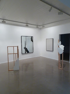
The exhibition starts in the first floor, with the main gallery room consisting of one piece from each artist. Pictures and thoughts about all three exhibitions will be posted soon!

Main exhibition room

Petter Buhagen 

Anja Carr

Monica Winther

Wednesday, October 17, 2012

Olve Sande "Flats" at Akershus Kunstsenter

The other exhibition, that was in house when I started my internship, was Olve Sandes exhibition of flats in different expressions and materials. His work is detailed and accurate, maybe in contrast to the other exhibition in house? The different pieces of the exhibition floats into each other, as forms and details from one piece is used "with a twist" in another, and I get a peaceful and almost meditative state of mind by walking through the rooms.

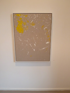
"Floorpiece in yellow and white"
by Olve Sande 

"No better cure than Business" and "Working for Abstraction (Big Black)"
by Olve Sande

"Possler totem II" and "Possler totem I"
by Olve Sande

"Linoleum Composition in Grey with Knife" and "To Skim Flat Dreams (blue)"
by Olve Sande

"Bolton Landing Flats"
by Olve Sande

"Draving No. 1"
by Olve Sande

"Forms of Continuety"
by Olve Sande

"Working for Abstraction I and II" and "Dedication to M."
by Olve Sande
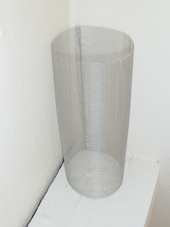
"Untitled Sculpture work" and "To Lie Down upon Nikita"

Clemens Behr and Olve Sande at Akershus Kunstsenter

For 10 weeks this fall I will be in an internship at Akershus Kunstsenter in Lillestrøm, 10 minutes from Oslo. There will be three exhibitions during my internship, and I will try to present them all on this blog.

The first exhibition I got to experience from "the inside" was Clemens Behr's "Suspended bins and broken windows" and Olve Sande's "Flats". Unfortunately the exhibition is down already, I helped dismantling it, but feel free to have a taste of what it was like through my eyes and impressions.

Here comes the first part, stand by for Olve Sande soon!


Clemens Behr
"Suspended bins and broken windows"

Akershus Kunstsenter, wall piece by Clemens Behr

Approaching the premises, the first piece of the exhibition visualizes. Clemens Behr is known for his origami-like pieces made from cardboard and other recycled, thrown-away and used materials. In this exhibition the main material is wood and other building materials, like plasterboards and plexiglas.

Inside the first room of the exhibition, "a mess of" building materials is installed in the room from floor to roof. I meet chaos, but somehow a nice chaos. Clean and obviously made with a smile. The spots of life in the green plants softens the expression and the linearity of the piece.

Clemens Behr

Clemens Behr

Clemens Behr

Walking the exhibition with Tor Arne Samuelsen, the exhibition-manager of AKS and my supervisor during my time at AKS, told me it reminded him of building tree-houses in the woods as children, and I felt it suited just fine for the feeling of the room.

The second part of the exhibition was made out of pieces of painted plexiglas, both as wall-pieces and sculptures.

Clemens Behr

Clemens Behr

Clemens Behr


The peace and softness of the visual expression, combined with the hard and sharp texture of the glass stood in great contrast to the chaotic but softened first impression. The green plants could also be found in this room, connecting the two exhibition rooms with life.

The last piece was made of two plastic garbage bins, cut and made floating in the air on invisible strings.


Clemens Behr


Monday, October 8, 2012

Portfolio and website

The last year of my bachelor started with making a portfolio to show what I have been working on the last couple of years. I have also started making my own website, and my portfolio is the first content on this page. Please have a look, and as always, -all comments are welcome!

Friday, May 4, 2012

Format, scene, placing and colors taking shape


Alt 1


Alt 2

The above alternatives, or a combination of them is probably the final scenes for my exam. I have worked with scene, format, coloring, placing of objects, generating space in the picture and drawing techniques. So far the period have gone well, and I am happy with both the process and the preliminary result.

I plan to use next week to write about ideas and references, and start testing paper quality. I have an idea of using different texture in paper on the two pictures, to further emphasize the different feelings of the two.


Preliminary list of references/inspiration:

Tuesday, April 17, 2012

Exam - Contrasts

This years exam is about contrasts. I started up with a vague idea of what kind of contrasts I would like to explore in this project, and after having a sit-down with my drawing teacher, I have found out what I will work with the next weeks.

The darkness and the light within people and within the society we create around us, the seemingly innocent misleading of others, resulting in misleading ourselves and creating a society where true feelings and honesty gets in the shadow of lies and betrayal. A world where you don't trust anyone, not even yourself.

I have decided to use the photos from my photo assignment earlier this year, and make one or more drawings from this. I want to see if I can further emphasize the contrasts in the scene with my drawing, and have started with the format and the placing of the objects on the paper. I have also started testing with different techniques and tools to find out what combination of these will help giving the drawing the right feeling and expression.

Wednesday, April 11, 2012

"Float or Sink"

The "Out of the comfort zone" project was presented at school a couple of weeks ago. I have already started working on my exam project for this year, but felt I had to present also the last project here on my blog before I give all my attention to the exam.


"Float or Sink"

Staying afloat can be a challenge, both physically and mentally. The trick is to pick up a form and create yourself from a material able to hold you up. Having flow requires being afloat, but will not necessarily come as a natural consequence of being afloat. Flow involves more movement and energy than just the stabilizing force that allows you to stay afloat. Stability and movement are fundamental elements to move on, being in the water, in life or as a society in general.

Exhibition of "Float or Sink" with sketches and inspirations

I have really loved working with this coal and pastel picture! I have learned a lot about light and shadows, and the color added with the pastel really helped giving the picture the depth and tone it needed to be interesting. All in all, a lot of good learning before the final project of this year, -my exam. 

Thursday, February 23, 2012

"Out of the comfort zone"

Our last project before this years exam is called "Out of the comfort zone" and is meant to give us a full review of what is expected for the final project, and takes us step by step through the exam process. As the title suggests, it is also designed to make us push ourselves towards exploring new techniques and expanding our inner borders. The teacher on this project is Associate Professor Inger Marie Søyland. Three weeks into the project I have to say I am impressed by her impressive knowledge and great communication skills! Thanks!

The result of the project should be a two dimensional picture (not a photo) of a shape in a space, and our first task was to make a shape of a cone, cylinder, cube or pyramid, and take pictures of this in an architectural context. We where to look for concepts and interesting lines, perspectives and light in the pictures taken, and choose one to work with in self chosen material and technique. Below you can see some of the pictures I took. The first one is taken in very limited light, and further exposed in Adobe Bridge, and is the one I have decided to work with, in charcoal on paper.


Sunday, February 12, 2012

"Tradurban"

Our third project this year, called "Streetwise", was about designing a cover for a band or an artist. Two additional products to promote the music and the band was also to be presented. The band and the album/single was our own choice to make, and also the target group of customers. To guide us through this project, the school had hired in Carl Gürgens and Henrik Fjeldberg from the graphics design and art direction company, Your friends. Thanks for great inspiration and a fun project guys!

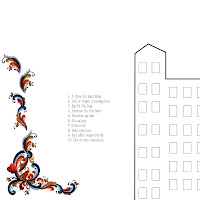
Lately my mind have been occupied with thoughts on the traditional and the modern. Tradition has always been an important part of my life, for better and worse. Norwegian traditional patterns and techniques are often inspirational sources for my work and thoughts, and one of my favorite bands, Valkyrien Allstars, is fitting right into this picture. The Oslo-based Hardanger Fiddle trio has sold a lot of albums in Norway, managing to renew traditional Norwegian folk music and create a wide and diversified group of fans.

For this project I chose to make an international debut album. The trio have successfully toured the Nordic countries, Germany, England and the Netherlands, China and Japan to mention some. Making the target group international, I felt more free to use Norwegian traditional patterns without it seeming to cliché. My aim was to combine the traditional Norwegian and the urban modern city, reflecting the musics modern and traditional vibes.

Front
Back


The process

I started up brainstorming the concepts of tradition and urban/modern, including techniques and visual effects and patterns. Being a design and not an art project, I had to keep in mind the customer and not only my own preferences. It started up as a collage-like cover, and I collected ideas and inspiration on internett, old clothes and by taking pictures in the city. The sketches quickly got filled up with ideas, but a sit-down with Carl Gürgens made me able to clean up and work with two different approaches, one minimalistic and one maximalistic. I pretty soon decided to go for the minimalistic style, both due to own preferences, but also to emphasize the two main elements of tradition and urbanity.

The final design is put together by four elements;

The city
This is probably a known element of mine for those of you who have followed me in my earlier work. In this piece I decided to simplify as much as possible to keep the minimalistic touch on the cover.

Rose-painting (traditional Norwegian pattern)
The rose painting I have borrowed from the Folk art life page, and is made by Bernetta Pritchard, as I did not have the time and the skills to make it myself on this stage. The choice of the Telemark rose-painting pattern is very special for me, as my family is from Telemark, and lots of my folk music and traditions arise out of this place.

Valkyrien logo
The Valkyrien part of the logo is made from the sign on the door of the pub/restaurant where the band got it's name. In this restaurant, located in Majorstua in Oslo, the band played a lot in their early days, being right around the corner both of the collective where the band members lived, and also the Norwegian Academy of Music where the band members studied.

Font
The font American Typewriter ended up as my choice for the "allstar" part of the logo, and for the list of songs on the back. I personally like this monospace font very good, and feel that this font emphasizes the minimalistic expression in the cover, having something nostalgic over it, but at the same time with an urban feeling in its simplicity.


Promotion products

When choosing the additional products to design, I wanted to design one modern and one traditional product. The suspenders brings out the traditional Norwegian, and the international and urban cover for iPhone represents the modern. It was important for me to get the two additional products clearly connected with each other and the cover. The same elements are therefor used for all three products.


Sunday, January 15, 2012

Reflection on Untitled (What you see or how you feel?)

I have finally finished the written part of the final digital photo assignment. A translated (long..) short-version follows:

In this assignment I have worked with the consepts of perspective and perception. I want to question what we see and what we experience in relation to how things are, or how others see and experience the same phenomenon. To give a new dimension to my earlier works with buildings and facades, I chose human emotions for this assignment. The results consists of five images, where the shadow and the model has a different pose.

All photos are taken at home in my living room. Parquet floors were hidden under white fabric to neutralize the background and to bring out the shadows. I have used a halogen work light and my Panasonic DMC-TZ10 compact camera for the photo shoot. In addition to me and the model, I had help to hold the light, which proved to be time-saving, as the light constantly had to be adjusted to get as clear and independent a shadow as possible. After using time to find out how I could get both shadow and model clear on the pictures, I found it was best to focus on one at a time. The downside of this was that I later in the process, of putting together the images, missed a few postures in either shadow or model.

Initially I planned to work with "opposite" feelings in the model and the shadow, but I came to the conclusion that this was not necessary to bring out my point. I decided the important thing was to have distinct different feelings posed. I especially like the apparent angle between floor and wall in the shadows, creating depth and space in the images even after cutting away all the background. In the picture with the "jumping shadow" the feeling of space is not as clear, despite the angle between wall and ceiling in the shadow. This makes it, in my opinion, the weakest picture in the series.

I focused on the consept in this photo series, and wanted the pictures to be as simple and clean as possible. All images are converted to black / white and the contrast is increased. No other changes are made to the original. The shadow and the model is cut and pasted on a white background, placed in "natural" relation to each other. As conceptual art, I think the pictures have a purity and a simplicity about them. The cutout is coarse and simple, which reinforces the conceptual and prevents the aesthetics taking over for the idea. I am inspired by Bernd and Hilla Becker and the simplicity and clarity that is in their pictures. Even if our ideas are very different, I wanted to take advantage of this perceived simplicity and clarity of my project.


I have done almost no aesthetic considerations in this assignment. The only conscious one is the choice of having the image with the jumping shadow in the series. Despite the fact that this was my least liked picture, I wanted to include this to get a balance with the image of the jumping model.The selection of pictures for the series can thus be said to be partly aesthetically based, while the images themselves are not. Conceptualism has been a very exciting and new way of working, and I hope to do it more.


The photos are thought printed on 50 x 70 cm aluminum plates. I want the pictures to have a certain size in order to clarify the position and the contrast between the model and shadow.

The series of pictures is made to remind us that what we see is not always what we see ....